Just two years ago, our Recession Scorecard was flashing nothing but green lights for the U.S. economy. That unequivocally unanimous rating began to deteriorate in the summer of 2022. First, in July 2022, the Treasury yield curve inverted when the 1-year Treasury yield rose above the 10-year yield, signaling that credit conditions were tightening in a serious way. Every recession in more than 100 years has been preceded by such a yield shift.
A couple of months later another of our seven indicators—the Conference Board’s Leading Economic Index—went red by falling below where it had been a year earlier. This has occurred before the onset of every U.S. recession since the late 1950s, or for as long as this indicator has been around. In the months that followed, three more Scorecard indicators shifted out of the positive green zone and into cautionary yellow territory.
Now, a third Scorecard indicator has been rerated to the recessionary red column: as of Q1, the growth rate of U.S. nominal GDP has fallen below the federal funds rate. Such a crossing point has occurred either before or just after the start of every recession going back to the 1950s.
U.S. Recession Scorecard
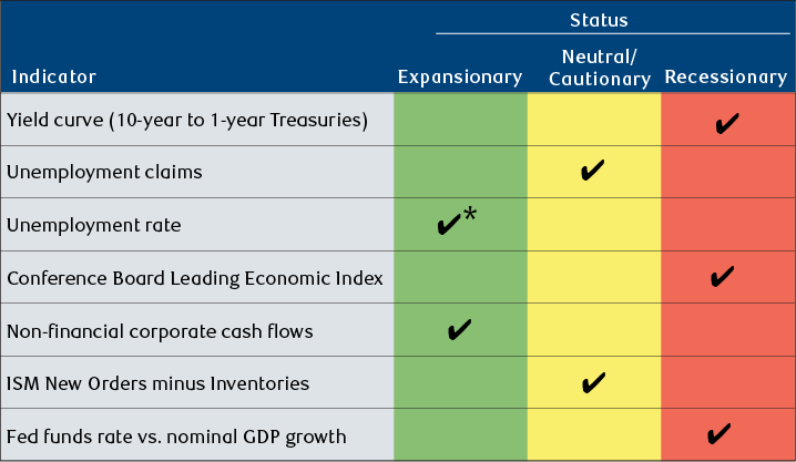
* Potential change to Recessionary status pending.
Source - RBC Wealth Management
| Indicator | Status |
|---|---|
| Yield curve (10-year to 1-year Treasuries) | Recessionary |
| Unemployment claims | Neutral/Cautionary |
| Unemployment rate | Expansionary; potential change to Recessionary pending |
| Conference Board Leading Economic Index | Recessionary |
| Non-financial corporate cash flows | Expansionary |
| ISM New Orders minus Inventories | Neutral/Cautionary |
| Fed funds rate vs. nominal GDP growth | Recessionary |
The notional economic linkage for this indicator is with categories of spending—primarily residential construction, business capital investment, and consumer spending on durables—for which the cost of borrowing is an important determinant. While not the largest component of GDP, at about 25%, spending on fixed assets and durables is highly cyclical. It is often a major contributing factor to recessions, usually going into outright decline under pressure from high interest rates, restricted availability of credit, and falling consumer demand.
One other Scorecard indicator—the unemployment rate—could be poised to flip into the red column, perhaps as early as next month. U.S. unemployment has risen in three of the past four months and now sits at 4.0%, its highest reading in almost two-and-a-half years. That has been enough to turn our trend-smoothing line for this data series upward for the first time since the onset of the COVID-19 pandemic.
As things stand, three of the seven indicators are rated “Recessionary,” and two are set at “Cautionary,” while two remain at “Expansionary” green. If the unemployment rate shifts to red next month, the count will become 4, 2, and 1. There is no score that makes a recession unquestionably inevitable. But even at today’s levels, the Scorecard portrays a decidedly different risk profile for the U.S. economy than the wall of green that prevailed in the decade following the global financial crisis and was restored within a few months of the short-lived pandemic-induced plunge.
U.S. recessions and equity bear markets in the developed world’s stock markets tend to go hand in hand. In our view, a redder tilt in our Scorecard should keep investors alert to a riskier, more challenging environment for equities that might arrive in the coming quarters.
Beware U.S. recessions
Equity bear markets typically accompany economic contractions
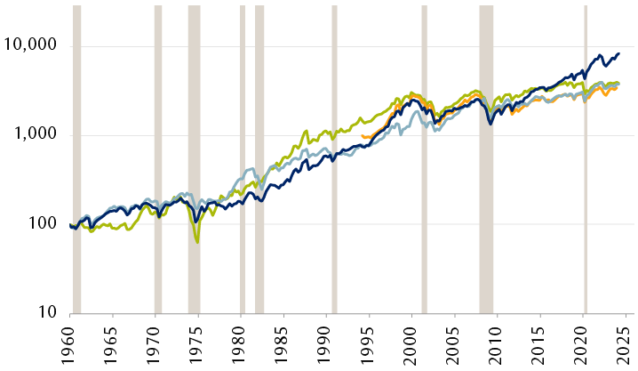
The line chart shows the performance of four major equity indexes since December 1959: the S&P 500, S&P/TSX, MSCI Europe (since 1987), and FTSE All-Share. Performance is shown on a logarithmic scale, indexed to December 1959 = 100. Periods of U.S. economic recession are highlighted. All four indexes have followed similar generally rising paths, with periods of declining performance corresponding to recessions.
Shaded areas represent U.S. recessions.
Source - Standard & Poor’s, Toronto Stock Exchange, FactSet; quarterly data through 3/31/24, shown on a logarithmic scale, indexed to December 1959 = 100